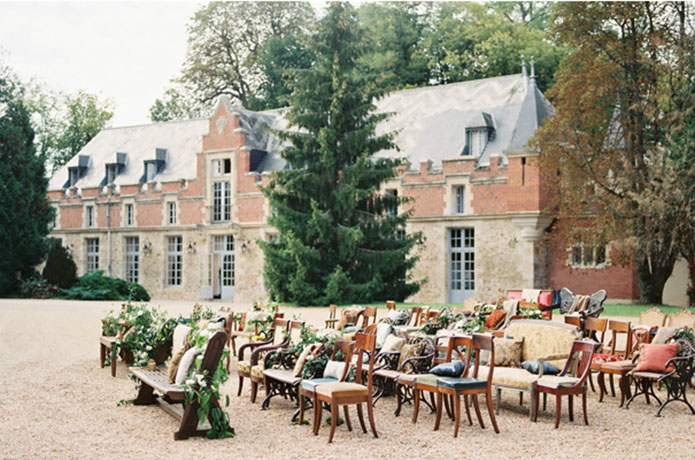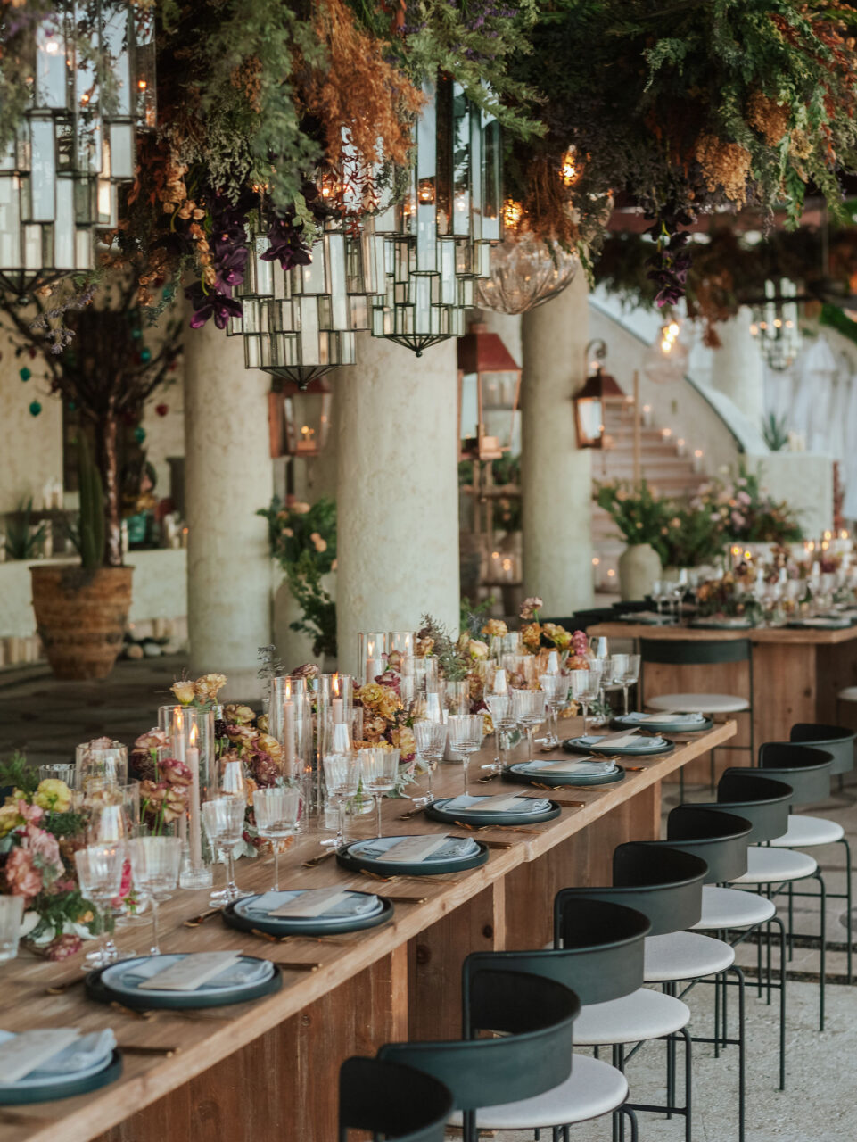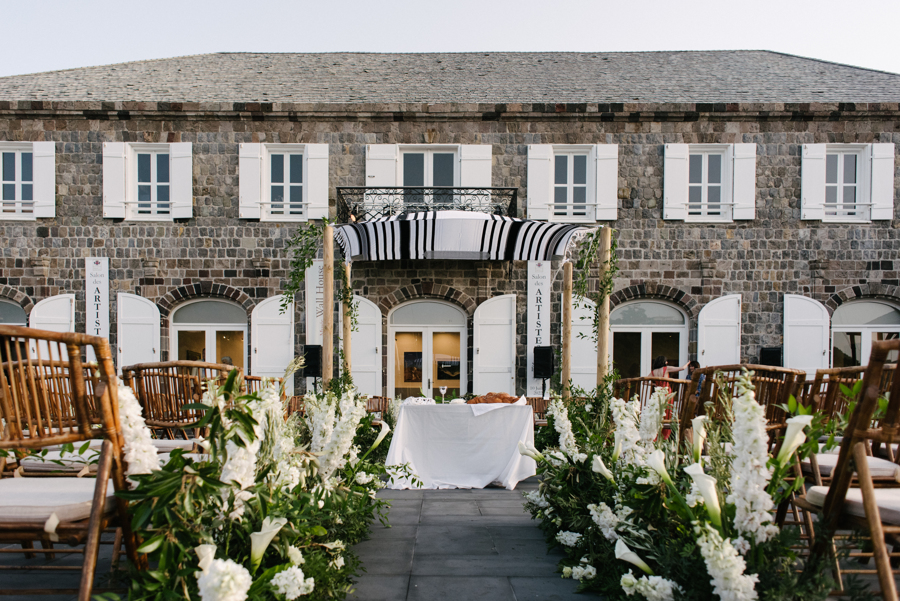
So many couples out there spend lots and lots of time hunting for the exact shade of ribbon that matches the envelopes of their invitations which also matches the stitching on the bridesmaid’s shoes and so on and so on, but I say, no more. Not only will this make your head spin in circles, but in the end the focus of your design becomes these one or two colors that have now vomited on your event. The colors rule you and your design instead of you ruling the design. All of the sudden you are buying hot pink toe nail polish for the bridesmaids and purchasing items like purple pens for favors just because they are in your color scheme. Instead of having the effortless celebration you were going for, you now have a pink mess that includes pink favor boxes tied with the perfectly matched pink ribbon enclosing the perfectly matched pink macarons which now match the pink napkins at the cocktail hour and the pink ties on the groomsmen. Rather than forcing yourself to choose a strict color palette, plan on choosing a color story along with bringing in elements that you simply just like. You don’t have to have pink lemonade just because your wedding colors are pink and yellow. But, if you love a certain palette then plan to feature these colors without overdoing it. For example, if your “colors” are lavender and green, don’t be afraid include a variety of purples in the palette to make things look more natural all the while relying heavily on the lavender. Add some texture to printed items and even some of the accessories for the wedding party that feature hints of the palette without forcing it down your guests throats. Make your focus more on creating an atmosphere or a feel more so than anything else. Don’t worry if the paper on your placecards is not the exact color as the signature cocktail, because no one else will be. In fact, if you do overly match these types of things, guests might start to notice the slight OCD that you have been developing since the planning process has begun and that’s not good for anyone. But seriously, in the end, the event will look more approachable and sophisticated by not taking the obvious path to an overly matched event.
The above image was from Jessica & Chetan’s Parisian Wedding, where we create a Royal, Rustic affair paying little attention to the actual colors. Image by Steve Steinhardt.


